
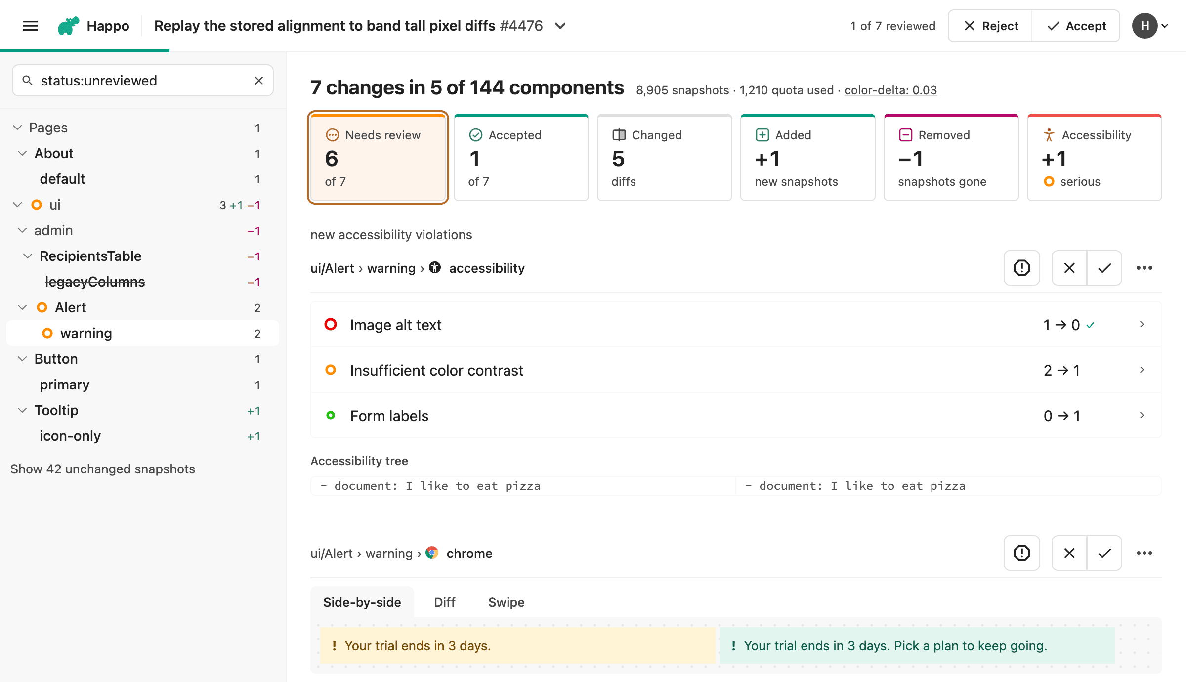
The compare page is where you review what changed between two Happo reports. A redesign of it has been brewing for quite some time, and it is available today as an opt-in. Along the way we have had really valuable feedback from many of you, about large comparisons, about reviewing together with teammates, and about finding one component among hundreds. That feedback shaped most of what follows, and it has led us to what we believe is a much more complete review experience.
The old page worked well for a handful of diffs. It got harder as comparisons grew:
- One code change often shows up as the same diff in dozens or hundreds of screenshots, and each one had to be looked at separately.
- A comparison could only be accepted or rejected as a whole. There was no way to record that you had looked at half of it, to split it with a teammate, or to say which diff was the problem.
- After pushing a fix, you started the review over.
- Finding one component among hundreds meant scrolling, or picking it from a long list.
The goals of the redesign follow from that: make fewer decisions for each comparison, keep the decisions you have made, always know what is left, and get from one thing to the next without leaving the page.
Per-diff review
In September, Accept and Reject became one-click buttons. They still applied to the whole comparison. On the new page every diff, added snapshot, and removed snapshot has its own accept and reject buttons.
This is what it changes for you:
- Your progress is saved. Each decision is recorded as you make it, and the header shows how far the review has come, for example "3 of 19 reviewed". You can leave and pick up where you stopped: when you come back to a review that is under way, the page opens on what is left to review.
- You only review what is new. A decision is recorded against the pair of screenshots, so it carries over to later commits on the same pull request. When you push a fix, the diffs you already accepted stay accepted.
- A rejection points at the problem. Rejecting one diff rejects the comparison, and the author can see which diff it was.
- You can share a review. Decisions from other reviewers show up while you have the page open, so several people can split a large comparison between them.
- The keyboard does most of it. New shortcuts accept, reject, and move to the next diff, so a review can be done without reaching for the mouse. The space bar takes a closer look at the diff you are on. On an image diff it switches between the highlighted changes, the before image, the after image, and an outline of what changed, just as clicking the diff does. On an accessibility snapshot it shows the lines of the tree that are hidden, and on an animated diff it plays or pauses the animation. Press
?to see every shortcut.
Once every diff is accepted, the comparison is accepted as well.
You don't have to review diff by diff. The Accept and Reject buttons for the whole comparison are still in the header, and they work as before.
Swipe to review on a phone
A review doesn't have to wait until you are back at your desk. On a phone or a tablet, drag a diff to the right to accept it, or to the left to reject it.
As you drag, the diff lifts off the page, and the panel behind it shows the decision you are heading for. A ring around its icon fills up as you go, and once it is full the panel reads "Release to accept" or "Release to reject". Let go before then and the diff springs back with nothing recorded, so a swipe you didn't mean costs nothing.
A swipe makes the same decision as the diff's own buttons. It is saved right away, the header counts it, and the page glides on to the next diff, so you can work through a comparison one swipe at a time.
Grouping
One code change often produces the same visual change in many places. The new page groups those diffs, so you make one decision for each change instead of one for each screenshot. A change to a shared header that touches 200 page screenshots is one thing to look at, not 200.
Grouping happens at two levels. Within a variant, targets that changed in the same way (the same diff in Chrome and Firefox, say) are folded into one row. Across variants and components, rows where exactly the same pixels changed are collected under the first of them, with a strip of thumbnails showing every member of the group.
One decision covers the whole group. You can step through the members to look at each one, and "Review separately" splits the group apart when one of them needs a different decision.
A new page structure
The layout is new from top to bottom. Each part is there to answer a question you have during a review.
- What am I reviewing, and how far along am I? The header replaces the navigation bar. It holds the pull request title, the review progress, and the Accept and Reject buttons for the comparison, and it opens to show the other projects in the same job.
- Where are the changes? The sidebar lists components and variants in a tree, much like the sidebar in Storybook. Each row shows how many diffs, added snapshots, and removed snapshots are under it, and gets a check mark or a cross once everything under it is decided. Selecting a row jumps to it in the list, and the tree follows along as you scroll, so you always know where you are.
- Where does the review stand, and how big is it? A row of counts sits above the list. First what needs review, what is accepted, and what is rejected, then what changed, was added, or was removed. Ignored diffs and accessibility violations get a count when there are any, and diffs that Happo ignored automatically in this comparison are pointed out there, in case one of them is a change you expected. Selecting a count filters the page to those snapshots.
- What is next? A panel at the end of the list says what the review came to and links to the next comparison in the job that needs review. You stay in the flow of reviewing, without going back to the pull request to find the next project. When the page opened on what was left to review, the panel also says how many diffs reviewed earlier it left out, with a button to show them all.
One filter box
The old page had two filters, one for components and one for targets. You could show a single component or a single target, and that was it. There was no way to ask for the diffs nobody had looked at yet, or to combine two conditions.
The new page has a single filter box at the top of the sidebar, and it narrows both the tree and the list. Type free text to match component and variant names, or use terms such as component:, variant:, target:, status:, change:, and format:. The box suggests terms and values as you type. When you return to a comparison that is partly reviewed, the box starts out as status:unreviewed, so you see only what still needs a decision. Clear it to see everything.
Terms combine, so target:chrome status:unreviewed shows the Chrome diffs that are still undecided. That makes it possible to work through a large comparison in passes, one browser or one part of the app at a time. The query is part of the URL, so you can send a teammate a link to exactly the diffs you want them to look at.
Tall screenshots
A full-page screenshot can be thousands of pixels tall, with a change that covers a few dozen of them. On the old page you scrolled to find it.
The new page collapses the unchanged stretches of a tall diff, the way a code review tool collapses the unchanged lines of a file. The part that changed is on screen right away, with some of its surroundings, and each collapsed stretch can be expanded when you need more context.
Accessibility violations, shown where they are
An accessibility snapshot lists its violations as rules and CSS selectors. To find out which element a violation was about, you had to read the selector and the HTML and work it out yourself.
On the new page, a snapshot with violations opens on an annotated screenshot of the part of the page they are in. Every failing element is outlined and pinned with a number, in the color of its impact, and selecting a pin shows what is wrong with that element. You see at a glance where the problem is, and whether three violations are one button or three.
A List tab has the violations as a list, as before, and each element in it now comes with a close-up cut from the same screenshot, carrying the same number. In a comparison, the pins are the violations that changed, and the unchanged ones can be shown when you want the full picture.
Diffs with new accessibility violations are also listed first, and the tree marks the components and variants that have them, so they are hard to miss.
Other changes
- Renames. Happo already recognized a snapshot that looks the same under a new component or variant name. Renames are now kept out of the review altogether: they need no decision, and they stay out of the list unless you ask for them.
- Snapshot history. From a diff's menu you can open the history of that snapshot and see its other targets, which helps when you are deciding whether a change is a flake.
- Animations. Animated diffs can be played, paused, and stepped through frame by frame.
- Report, components, and job pages. These pages use the same header, tree, and filter box, so moving between them feels like one product.
A new dashboard
Your dashboard is now built around a single feed of jobs. The old dashboard was a set of cards, one each for the latest comparisons, reports, and jobs, and finding the job for your own pull request meant going to a separate jobs page.
The feed and the row of numbers above it replace those cards:
- Jobs by day, one row for each pull request. Jobs are listed under the day they ran, and the jobs for one pull request are collapsed under the latest, so a pull request with twenty pushes takes up one row.
- The size of a change before you open it. Each compared job has a scale of five marks, filled according to how many snapshots changed. Five empty marks mean nothing changed. It tells you which jobs will take a minute to review and which need more time.
- The same filter box. Free text matches the pull request title or commit message, and terms such as
project:,author:,repo:,is:pr,is:baseline,pr:,sha:,after:, andbefore:narrow the feed further.author:@meshows your own jobs. As on the compare page, the query is part of the URL, so a filtered feed can be bookmarked or shared. - The account at a glance. A row of numbers at the top sums up the last 30 days: jobs, new flakes, accessibility violations, and, for account admins, snapshots used in the billing period. Each number links to the page with the details.
The new dashboard is turned on together with the new compare page, so there is nothing separate to opt in to.
Emails that say what changed
If you run Happo with --notify, you get an email when a comparison is ready. That email now tells you where the comparison stands and what changed, so you know before opening it whether it needs you.
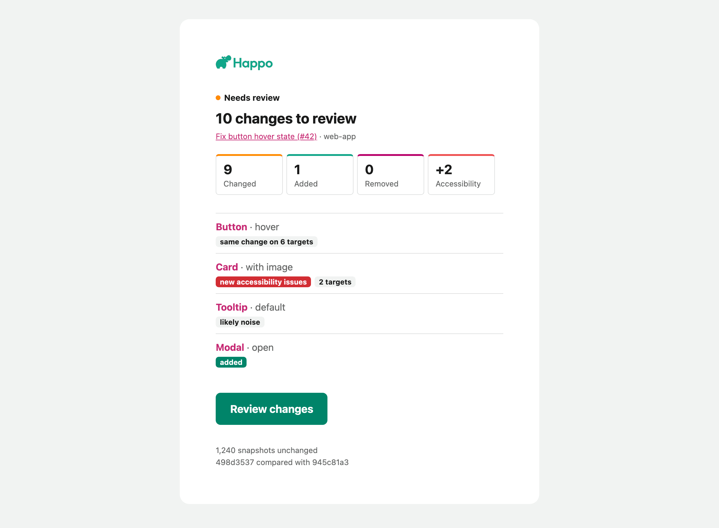
- Where it stands. The email opens with the comparison's status: it needs review, nothing changed, or it is already approved or rejected. The subject line says the same, followed by the pull request or commit title when the run passed one. When every change was already accepted on an earlier commit, the email says there is nothing left to review instead of asking you to look again.
- The same counts as the page. What changed, was added, or was removed, and the change in accessibility violations, in the compare page's colors. Render errors and new accessibility violations that keep the comparison from being approved are called out.
- What changed, and where to look. The components and variants with changes are listed in the order the compare page lists them, each linking to its place on the page. Each one is marked with what stands out about it: a render error, new accessibility violations, an added or removed snapshot, a change that is likely noise, or the same change on several targets or in several variants.
- One thread per pull request. The emails for a pull request carry the same thread headers, so mail clients that group emails by them, such as Thunderbird, show them as one conversation.
The new email isn't tied to the new compare page: --notify sends it whether or not the page is turned on.
Built with AI agents in mind
The new page was designed with AI agents in mind, alongside the Happo MCP server. To group, order, and explain diffs, the page relies on a lot of context that Happo now collects when it compares two reports. The MCP server gives an agent that same context, so it reviews a comparison from the same picture you see:
- The review order and the groups. The agent gets the comparison listed the way the page lists it, worked out by the same code: in the order a reviewer should see it, starting with new accessibility violations, and with diffs that made the same change folded together. It looks at one diff from each group, and its decision covers the whole group, just as yours does.
- How much changed, and where. For each diff, Happo reports how much of the screenshot changed, in how many places, and where each one is in the before and after images. An agent can crop a tall screenshot to the part that changed instead of reading all of it, much as the page collapses the unchanged stretches for you.
- Content that moved. When a stretch of content was added or removed and everything below it moved, the agent is told where. A diff that looks changed everywhere often comes down to one inserted row.
- Noise. A diff where only the smoothing of edges changed, or where no pixel changed enough for anyone to see, is marked as noise. Those are strong candidates to report as flakes.
- Accessibility. The agent learns which accessibility rules a snapshot newly breaks, and gets a link to the annotated screenshot of where the violations are, so it can point at the element in its review.
- Where it rendered. Each snapshot comes with its browser and viewport. With
detectHorizontalOverflowturned on for a target, it also says how far the page reaches past the right edge of the viewport. A page that scrolls sideways on a small screen is usually a bug, and it is easy to miss in a screenshot. - What is settled already. The agent sees the decisions you and your teammates have made, including those carried over from earlier commits. It also sees which diffs are ignored and whether a person, the API, an agent, or Happo itself ignored them, and anything that keeps the comparison from being accepted, such as a render error.
An agent can accept or reject one diff, or a whole group, exactly as you do on the page. A flake it reports is marked as coming from the MCP server, and ignored:mcp in the filter box lists them.
That makes it possible to split a review with an agent. The agent already has your code change in context. It can accept the diffs that follow from the change, and leave the few it is unsure about for you. When you open the comparison, its decisions are already in place, in the tree and in the progress in the header, and the filter box takes you to what is left.
See the MCP page for more on how this works and how to set it up.
Turning it on
We plan to launch the new compare page to everyone soon. Until then, you can get early access in two ways, and your feedback will help shape the experience that everyone gets:
- For yourself. The current compare page shows a callout asking if you want to try the new experience. Accepting it switches the page for you only. You can switch back from the account menu on the new page.
- For the whole account. Account admins can turn it on for everyone in the account from the account page, under "Experimental features", and turn it off again in the same place.
We would love to hear what you think of the new compare page! When you finish a review, the end of the page asks how it went, with a thumbs up or down and room for a comment. You can also send feedback to support@happo.io.

