
For a long time, I've envied applications that switch seamlessly between dark and light mode depending on the time of day. When I started building happo.io in 2016, dark mode wasn't a thing yet, and I was ignorantly happy with having the website shine bright like the sun, day and night. Recently I realized that most applications I use embrace the effort to make UI easier on your eye by automatically switching over to dark mode when the sun sets.
In this article, I'm going to walk you through the process of adding a dark theme to happo.io. It starts with some prep work and then continues into the nitty gritty details of getting all components and pages to work with both a light and a dark mode.
Replacing hard-coded css colors with variables
The first step I did was to find all hard-coded colors in our codebase. These will often be in hex format (e.g. #f0f3f4), and in our case we had some rgb and rgba colors as well. For each hard-coded color used, I replaced it with a css variable and added to the top of our global css file. It looked something like this:
:root {
  --text-color-dark: rgba(65, 65, 65, 0.9);
  --background-color:  #ffffff;
}
While doing this, I found that we used a lot of similar colors. They weren't exactly the same but close enough to not merit adding separate css variables for them. For instance, we had 9 shades of very light gray that I consolidated to a single css variable, --color-gray-lightest. In the end, the total number of colors used was 11.
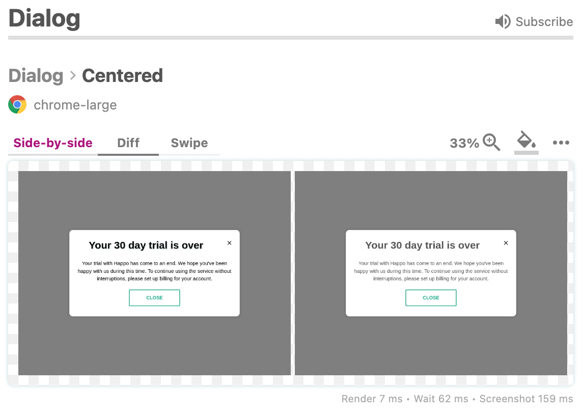
To prevent bugs from seeping into the process, I relied on our Happo test suite. After adding css variables, I saw a lot of diffs where the colors looked just a little different. Like this one:
Adding dark themed colors
The next step in the process was, through a lot of trial and error, introduce dark versions of all the css color variables. But before I dive into that, I wanted to make a quick note on variable naming. When I converted hard-coded colors to css variables, I initially named the colors what they looked like (e.g. "--color-gray-light", thinking that I would go back and replace those names with semantic names. Several resources on dark mode suggests using semantic names (e.g. "success" instead of "green"). I think this makes sense if you are a larger team and need to communicate clearly between developers, designers, etc. But for me, it seemed easier to keep the color names representing what they looked like in the light version, and then have dark mode kind of invert the rgb value. The name --color-gray-light is in the dark version a dark gray one:
@media (prefers-color-scheme: dark) {
  :root {
    --color-gray-light: rgb(80, 80, 80);
  }
}
It's possible that this will come back and bite us at some point. But for now it seems okay. 🙂
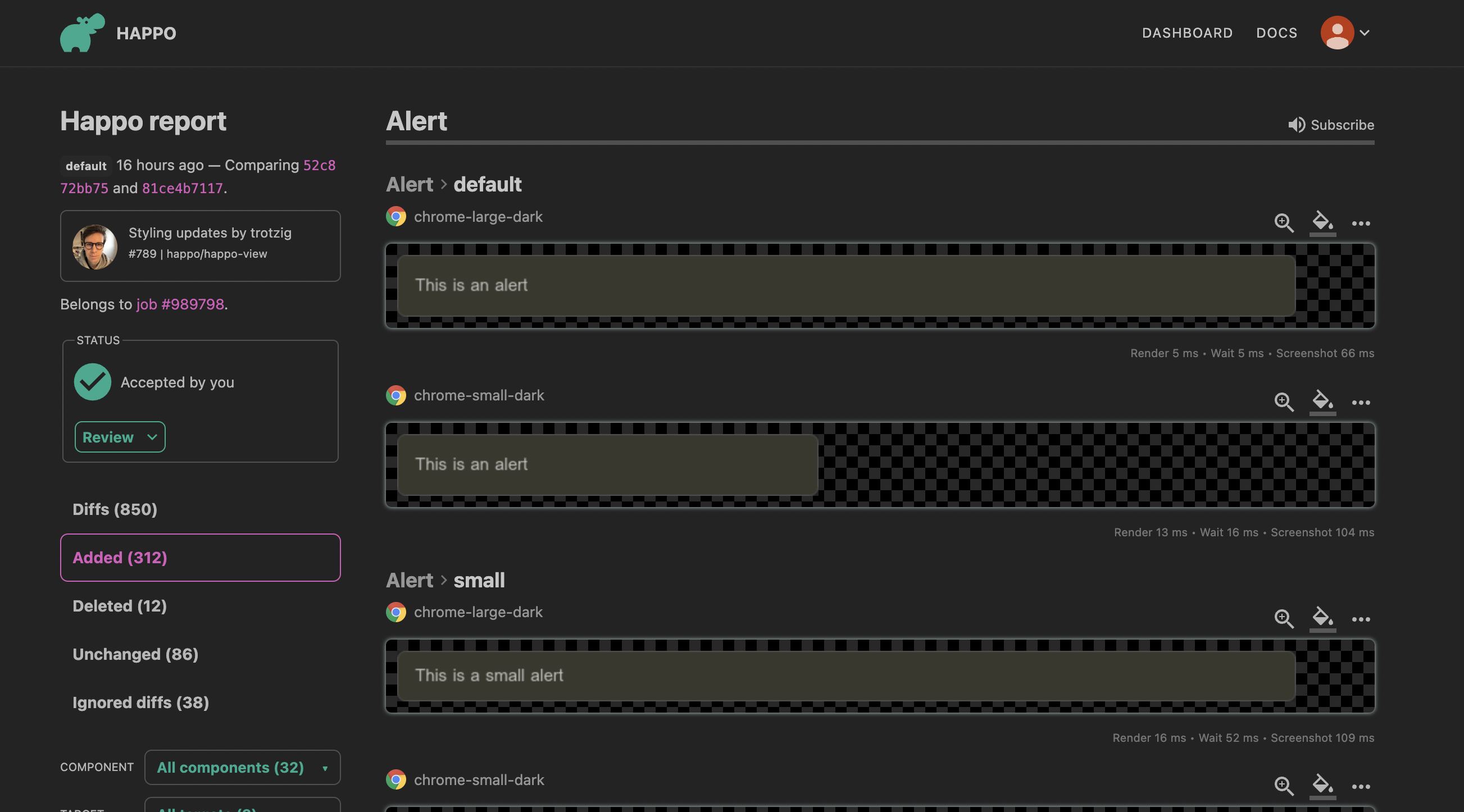
Okay, now for the fun part. It turns out that introducing css variables was 90+% of the effort. Because now I could start playing around with dark versions of the colors. I did an initial effort and then decided to let Happo help out with the heavy lifting of rendering dark mode in all of our components and views. Thankfully we have an extensive screenshot testing setup for Happo internally (dog-fooding is great) so I just had to add new Happo targets using dark mode. This is in our .happo.js configuration file:
targets: {
  'chrome': new RemoteBrowserTarget('chrome', {
    viewport: '1024x768',
  }),
  'chrome-dark': new RemoteBrowserTarget('chrome', {
    viewport: '1024x768',
    prefersColorScheme: 'dark',
  }),
},
With the prefersColorScheme: 'dark' setting for a target, Happo will emulate being in dark mode and the screenshots will show the dark mode of your application. That is, as long as you are setting styles and variables with a @media (prefers-color-scheme: dark) detector (or a JavaScript equivalent).
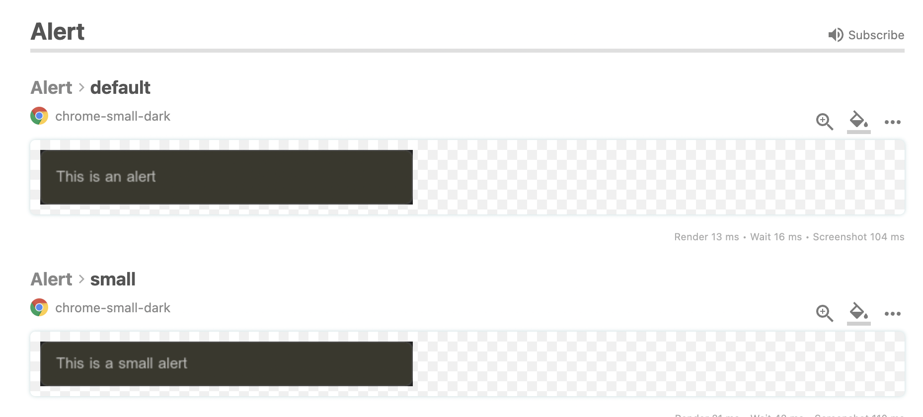
I found a number of issues with how things were rendered in dark mode, and over the course of a few days I kept iterating on addressing issues, running Happo tests, addressing new issues, re-running Happo tests, and so on.
The hardest category of issue to solve was when I found hard-coded colors in places outside of css and javascript. I found colors in png and svg images, third-party libraries (e.g. Stripe), and other places. The fixes usually involved replacing the image with a more neutral one, inlining svgs instead of using external ones, and in some rare cases, duplicate content and use feature detection to switch depending on color scheme (I can't recommend this however). I ended up with a handful of these hacks, and I'm sure they will bite back at some point. But for now both color schemes look decent.
Adding a switch
Letting the operating system decide what color scheme to apply works in most cases, but some users want more control. To allow people to override the current color scheme, I added a select switch to the footer of the application.

The default value is "Auto", which will let the operating system decide. If you select "Light" or "Dark", you will override the default setting. The override will be stored in localStorage, so next time you come back your setting will be in effect. The setting doesn't transfer between browsers and devices however, so if you browse the app on your phone there's a chance you get a different theme.
The switch is also present on the User Profile page and I might add it to a few more places as well to make it more discoverable.
Conclusion
Adding dark mode to happo.io was more fun than I had imagined. It is a great opportunity to audit your frontend code and improve color usage to make things more consistent. I hope you take the opportunity to do this for your application as well. With the help of Happo and screenshot testing, the process is a lot smoother.